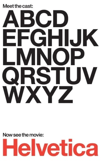
Helvetica
Helvetica is a feature-length independent film about typography, graphic design and global visual culture. It looks at the proliferation of one typeface (which will celebrate its 50th birthday in 2007) as part of a larger conversation about the way type affects our lives. The film is an exploration of urban spaces in major cities and the type that inhabits them, and a fluid discussion with renowned designers about their work, the creative process, and the choices and aesthetics behind their use of type.
-
- Cast:


Similar titles
Reviews
I don't have all the words right now but this film is a work of art.
Good movie but grossly overrated
I like movies that are aware of what they are selling... without [any] greater aspirations than to make people laugh and that's it.
The first must-see film of the year.
A long, long time ago, I decided to take a graphic arts class in High School, funny thing is, I didn't even know what graphic arts was! It was my freshman year, it was a new school, and I found myself deep in the darkness of the schools basement, standing in front of double doors that opened to a room filled with noisy printing presses. "AHAA! This is what Graphic Arts is, I had know idea!" Throughout life I often get that "I had no idea" moment, and watching the documentary Helvetica, made by Gary Hustwit in 2007, gave me another one. Even with my short time learning about type in that Graphics class many years ago, I had no idea of the amount of time and work that went into creating Typography. Even more so, I learned that the typeface that I've seen just about every single day, everywhere you look, has a name. That name is Helvetica.As the documentary starts, the director pans through the streets of New York City and you quickly realize that Helvetica is everywhere. From company logos to subway signs to the titles of the Broadway shows – its used in so many ways. Erik Spiekermann, a German typographer says it best, "Its air, you know. Its just there. There's no choice. You have to breathe, so you have to use Helvetica." From there the director interviews many other typographers and designers and we learn about the history of this widely used sans-serif typeface. Helvetica was created in 1957 by Max Miedinger with Eduard Hoffman at the Hass Type Foundry of Switzerland. The aim of the new design was to create a neutral typeface that had great clarity, no intrinsic meaning in its form, and could be used on a wide variety of signage.[1] Hustwit interviews Alfred Hoffman, former director of the Hass Foundry and son of Eduard Hoffman and he talks about the naming of Hevetica: "Helvetia is the Latin name of Switzerland. My father said, that's impossible, you cannot call a typeface after a name of a country. So, he said, why don't we call it Helve-ti-ca. So, in other words, this would be "the Swiss typeface". And they agreed." The documentary continues with interviews of other designers and they each tell an interesting story along with their interpretation of the Hevetica typeface. I admit, I have never heard of any of the designers that were in this film. One that stood out to me was David Carson because I can relate to what he says: "I have no formal training in my field. In my case I've never learned all the things I'm not supposed to do. I just did what made sense to me. I was just... experimenting, really. So when people started getting upset, I didn't really understand why, I said, "What's the big deal? What are you talking about?" And it was many years later that someone explained to me that, basically, there was this group that spent a lot of time trying to organize things, get some kind of system going, and they saw me going in and throwing that out the window, which I might've done, but it wasn't the starting point, that wasn't the plan. Only much later I learned what determines modernism, and this and that..." I went on to find out that David attended SDSU and worked as a teacher at Torrey Pines High School from 1982 to 1987. Here's where it gets even more fun; about the same time that I was sitting in that Graphics Arts class, there was a 100 percent chance that I had a Transworld Skateboarding magazine in my backpack. At the time, I loved this magazine more than anything I still have the same issues stored away in my parents attic! It turns out that David Carson was the art director of Transworld Skateboarding from 1984 to 1988 – I had looked at his work a thousand times! I am really glad that I watched Helvitca and would say it's a mandatory watch for all design students or any history buff for that matter. I am even happier that I made the David Carson connection. Until today I never had a favorite designer and when I walk by that Quicksilver window art at Surf Ride I'll smile and revel in the fact that I know who created that design.One more note before I say goodbye. When I started to write this in Microsoft word, I just assumed that Helvetica was available as one of the default types. I was surprised to find out that its not and Arial is the closest font. Helvetica could be purchased from linotype and there are 36 different Helvetica typefaces @ $29 a piece. I think I'll be sticking to Arial!
The year 2007 marked the 50th anniversary of the Helvetica typeface. To most people, this little nugget of information (#fact if you will) means very little. Begin to show them however just how ubiquitous and ever-present Helvetica is in their everyday lives and you'll have their interest. Hustwit certainly got mine very early on.From street signs to Nike advertising campaigns, from littering notices to shop billboards, Helvetica is omnipresent. We must see thousands of words and phrases a day that use the Helvetica typeface, yet far from wonder why the typeface is always identical, we don't even recognise they are in fact the same typeface. Hustwit's 'Helvetica' delves into this gap, one that didn't exist for the viewer before the film started, but quickly engages our curiosity: why is it used so uniformly? why does it look so...clear? what does that say about us? where did it come from? who creates this stuff? It is a courageous director who opens that can of worms, but Hustwit takes to it with relish.Taking us back to Switzerland in the 1950s, the field of typography is laid out in full by a panoply of talking heads ranging from modern-day typographers, to graphic designers, to mere (and I use that reluctantly) artists. Perhaps fittingly, the issue of Helvetica's omnipresence remains the centre of attention for all those interviewed, how can they explain away the veritable phenomenon it has become? The range of responses elicited conveys a certain chasm in the field, the 'neutrality' that arises as the font's attraction is as much a joy and example of sheer artistry to one artist as it is depressing and mere bourgeois subterfuge to the next. The discussions of the aesthetic of the font, and of others' (failed) attempts to move beyond it, do risk at times moving beyond the film's appeal to the layman, but are forgiven for the passion they betray of the filmmaker and his subjects.As a font, Helvetica is more than simply an inspiration for the corporations that depend on its neutrality and aesthetic to promote their goods. It is an instrument that both lures figures into the design industry for want of its use and pushes those opposed to its capitalist connotations into usurping its ideals and creating their own fonts.Thus far, few have been successful and Helvetica reigns supreme on the street; have we reached the 'end of history' for typography? Helvetica may be its perfect form.Concluding Thought: Nothing to do with typography, but who knew 'Helvetia' in Latin was Switzerland? (#fact)
It is interesting how many subcultures there are concerning topics that most people rarely think about--model trains, Shaker furniture, Stone Age tools, and so forth. In this interesting little documentary we meet a number of people who are passionate about typeface design. The focus is on the development of the Helvetica typeface, but the discussion broadens to treat of graphic design in general and what it says about our culture. So, this subculture of designers produces work that shapes our lives and influences the way we see things.The film shows ample examples of how ubiquitous the Helveltica typeface has become, to the point that we more or less accept it as the default, like it has always been with us. But in truth it was designed in Switzerland in 1957 ("Helvetica" is Latin for "Switzerland"). One thing that impressed me with the interviewees is that they view their profession not just as a commercial venture but as a personal life mission. They can speak eloquently about their craft. Each type character is viewed as a work of art and to them a typeface can be appreciated as others might appreciate a Monet painting. These people can become ecstatic when describing how inter-character spacing can make words things of beauty, or ugly. One guy tells the story of how his wife was trying to describe where a store was and he says, "Oh, you mean the store with that ugly font." The general feeling is that Helvetica is pretty much the end of the line in the evolution of modern, clean, simple, easily- read typefaces. Any further developments along those lines will be nothing more than alterations of Helvetica.Of course there are those who view Helvetica as boring and pedestrian and strictly utilitarian, to be used only by those with no imagination. That view is represented by some of those interviewed. One of the more interesting parts of the film is a discussion of how companies use certain typefaces to express what they stand for. Giorgio Armani or Nieman Marcus are not likely to use Helvetica in their ads, whereas Walmart is. Although touched on briefly, I would like to have seen more examples of typefaces that pre-existed Helvetica, making a stronger case for why Helvetica has come to dominate.Almost everyone will come away from this film with a keener appreciation for typefaces and graphic design and the role they play in our lives. The final credits prove that using various Helvetica font sizes in different colors can have a most pleasing effect.
This is surely the best documentary I have seen. I use several metrics in this.A film is almost without exception a story. A documentary is usually presumed to be a found story, an existing one that the filmmaker merely exposes. We come to the thing expecting some coherent story, already formed, the problem having two threads: Can we trust the filmmaker? Does the story resonate? Often a solid position in one mitigates the other.But real life at least the life I know has no stories that are blunt. Real stories, the ones that weave themselves through the world, are rich, only somewhat visible, immensely intriguing and often educational. I expect to be puzzled. If there are "two sides," I immediately mistrust the teller, because true movement is simply itself.This film should be celebrated simply because it decides to present a story in its unformed state. We hear from designers young and old, clever and not. Some are geniuses and some see the genius of design and we have no idea which is which. They report profoundly different views on a typeface. Lest we think this is an irrelevant subject, the observations on the typeface are bridged by examples to show how thoroughly it has saturated. So we are left with the same form as "Ten Tiny Love Stories," perspectives that surround the notion and instead of pulling out the answer, illuminated the mystery. The simple fact is that this is a powerful, mysterious force that makes us do things. The comparison of font design and romance is not misplaced: both somehow relate to the bricks of stories we use in constructing a life or for some of us a fort to protect from life.So I can recommend this to you. I recommend seeing it with your partner, your real partner. And then sit with them quietly and reflect on the nature of clarity and knowing.I can criticize this though. There is much that could easily have been said that wasn't.Its usually presumed that spoken language is quite old and written language a relatively modern technology compromised to make it persist. In this context, type design is merely a matter of style, a choice.But there is evidence that spoken language predates modern humans and evolved over time through collaborative toolmaking, most particularly weaving and stonechipping. Acts of hands. Shapes -- physical form, with symmetries. Spoken language in this history is itself an adaptation, and written language perhaps closer to the core of how we think. In this history, shapes matter. The process of creating form in story all manner of form matters. The story is how the story is shaped.We bump against this intuitively. It was why the Macintosh was a giant step forward in the 80's, because storytellers could for the first time be storyshapers (publishers, in the corporate lexicon). And why Microsoft is such an evil. And why type design elements have become so deeply viral. The original features come from carved inscriptions and independently from monks' pens.Anyway, from that Mac beginning came a focus on type as never before. And several design journals that struggled with the issues spoken about in this film. Pulling them out of print to put on screen should carry some more weight than we have here. I am hoping that some truly talented filmmaker is inspired by this.The most edgy but still intelligent design and font design journal from the last decades is "Emigre," which you should peruse if this movie intrigues you. Also you might want to check out Darius, who was behind the first designed font.My typeface is Vendetta.Ted's Evaluation -- 3 of 3: Worth watching.